
Design Breakdown
Layout Approach
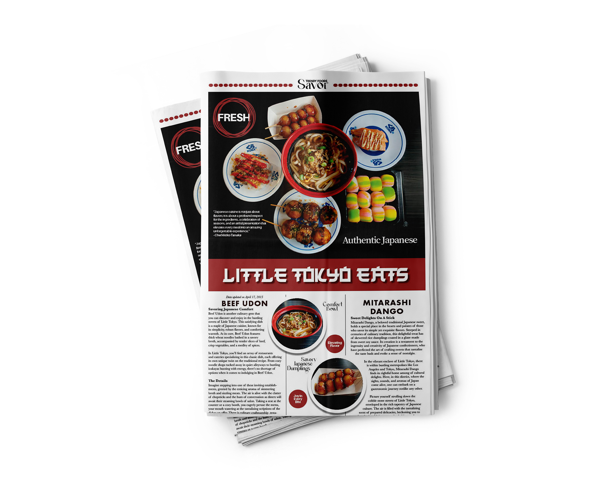
I aimed to balance energy and structure. Since Japanese street food is lively and bold, I reflected that with overlapping elements, varied photo sizes, and a dynamic use of space. A clean column grid helped keep everything readable and organized.
I aimed to balance energy and structure. Since Japanese street food is lively and bold, I reflected that with overlapping elements, varied photo sizes, and a dynamic use of space. A clean column grid helped keep everything readable and organized.
Circular Imagery
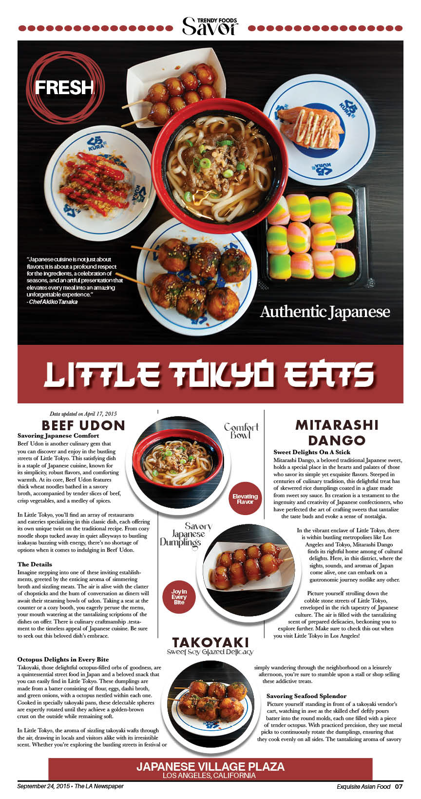
Many of the foods featured (like takoyaki and dango) are round, so I leaned into that visually. Using circular photo frames helped tie the theme together and gave the layout a playful, unified feel.
Many of the foods featured (like takoyaki and dango) are round, so I leaned into that visually. Using circular photo frames helped tie the theme together and gave the layout a playful, unified feel.
Typography Choices
I paired a bold, stylized display font for the “Little Tokyo Eats” headline with clean serif and sans-serif fonts for body text and subheads. This contrast kept things visually interesting while staying legible.
I paired a bold, stylized display font for the “Little Tokyo Eats” headline with clean serif and sans-serif fonts for body text and subheads. This contrast kept things visually interesting while staying legible.
Color & Graphics
I kept the color palette minimal so the food photography could shine. Small graphic accents like the red dotted line and “FRESH” label add visual interest without overpowering the content.
I kept the color palette minimal so the food photography could shine. Small graphic accents like the red dotted line and “FRESH” label add visual interest without overpowering the content.
Final Thoughts
This project challenged me to combine typography, layout, and imagery in a way that felt both informative and visually engaging. Designing around the vibrant food culture of Little Tokyo allowed me to explore how layout and design choices can enhance storytelling and appetite appeal.
It taught me how to balance structure with creativity, and how to use visual elements to guide the reader’s eye while keeping the content clear and exciting.