
Design Breakdown
Approach
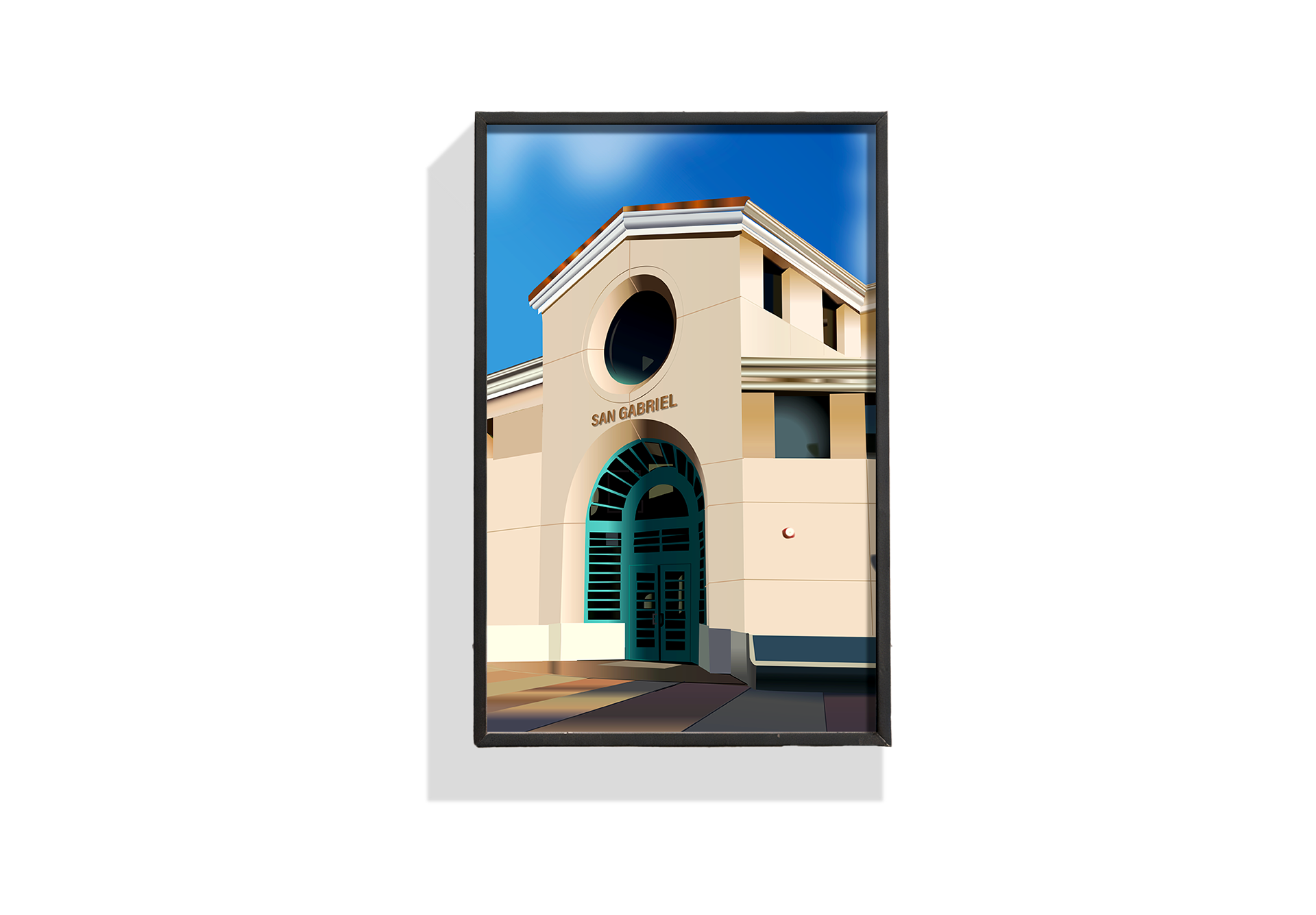
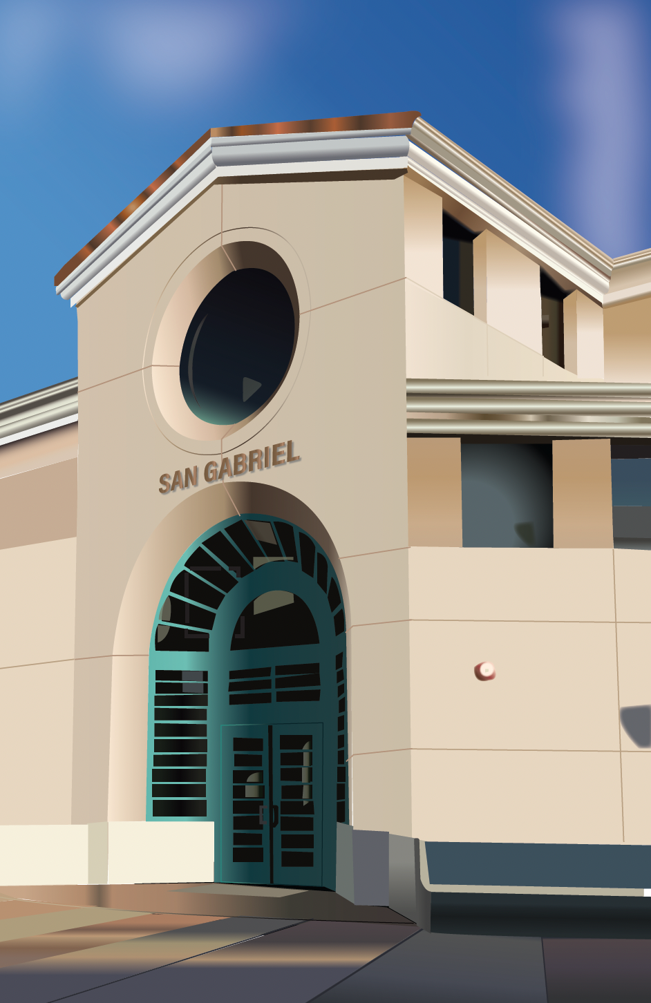
I started by studying the building’s structure and standout features, focusing on what made it recognizable — like its roofline, windows, and overall shape. My goal was to simplify those details without losing the building’s identity.
I started by studying the building’s structure and standout features, focusing on what made it recognizable — like its roofline, windows, and overall shape. My goal was to simplify those details without losing the building’s identity.
Style & Technique
I used a clean, vector-based style with solid colors and minimal outlines. This helped keep the illustration bold and modern, while still true to the architecture.
I used a clean, vector-based style with solid colors and minimal outlines. This helped keep the illustration bold and modern, while still true to the architecture.
Color Choices
The color palette is slightly muted to reflect the real-world look of the building but stylized just enough to feel polished and graphic. I used light shadows to give the piece a bit of depth without making it overly realistic.
The color palette is slightly muted to reflect the real-world look of the building but stylized just enough to feel polished and graphic. I used light shadows to give the piece a bit of depth without making it overly realistic.
Tools Used
This illustration was created in Adobe Illustrator, allowing for precision and scalability while maintaining a clean, professional finish.
This illustration was created in Adobe Illustrator, allowing for precision and scalability while maintaining a clean, professional finish.
Linework Over Photo
— Foundation Layer
— Foundation Layer
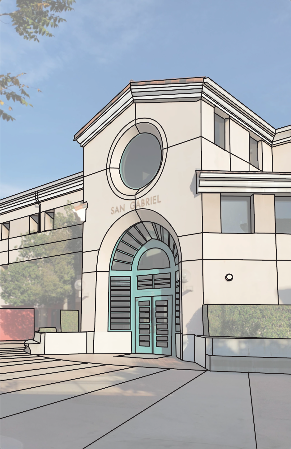
To begin the illustration, I traced over a reference photo of the San Gabriel building to establish the structure and proportions. This step helped me stay accurate to the real architecture while planning out which details to simplify or emphasize.
I used clean black linework to outline key elements like windows, framing, and architectural shapes. Keeping the photo visible underneath allowed me to build a clear foundation before moving on to full color and stylization in the next stages.
Final Thoughts
This project helped me explore how to translate real architecture into a clean, stylized illustration. Working from photo reference allowed me to practice accuracy, while using linework and color gave me room to express my own design style.
It was a great exercise in observation, simplification, and visual storytelling — and showed me how illustration can bring new life and personality to everyday spaces.